I was tasked with designing a beer can label for Kunstadt Sports (in collaboration with Beyond the Pale Brewery), specifically for their new “Apres Ski Brew”. The goal was to create something that captured the feeling of relaxing after a day on the slopes. I envisioned a design that was both eye-catching and evocative of winter sports and the cozy atmosphere of après-ski. After exploring various concepts, the final design features a bold “K” for Kunstadt, stylized with a cozy cabin wood type texture. Below, the name “SKI YA L8R” playfully hints at the end of the ski day, followed by “APRÈS SKI BREW” to clearly communicate the beer’s theme. The background, a textured blue reminiscent of a winter night sky with falling snow, completes the après-ski vibe. The white picket fence at the bottom is a subtle tie-in to Beyond the Pales logo design.


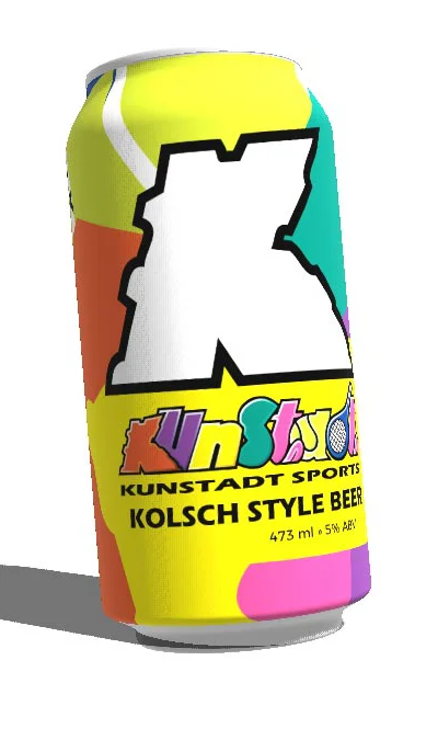
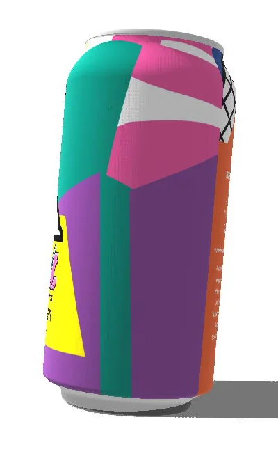
After the success of the Winter Beer, I was tasked with designing the label for Kunstadt Sports’ new summer beer. My vision was to create a vibrant and energetic design that not only represented the Kunstadt Sports brand but also conveyed the refreshing nature of a perfect summer beverage. The resulting label features a striking white Kunstadt “K” outlined in black, the central focus against a dynamic and colourful background. Upon closer inspection, this energetic backdrop is revealed to be composed of deconstructed and overlapping pieces of the iconic Kunstadt Sports logo, creating a sense of brand integration and playful visual interest.
The overall design aims to capture the essence of summer activity and refreshment, with the familiar elements of the Kunstadt Sports logo adding a unique and recognizable touch.